Module 9: The Power of White Space (Negative Space)
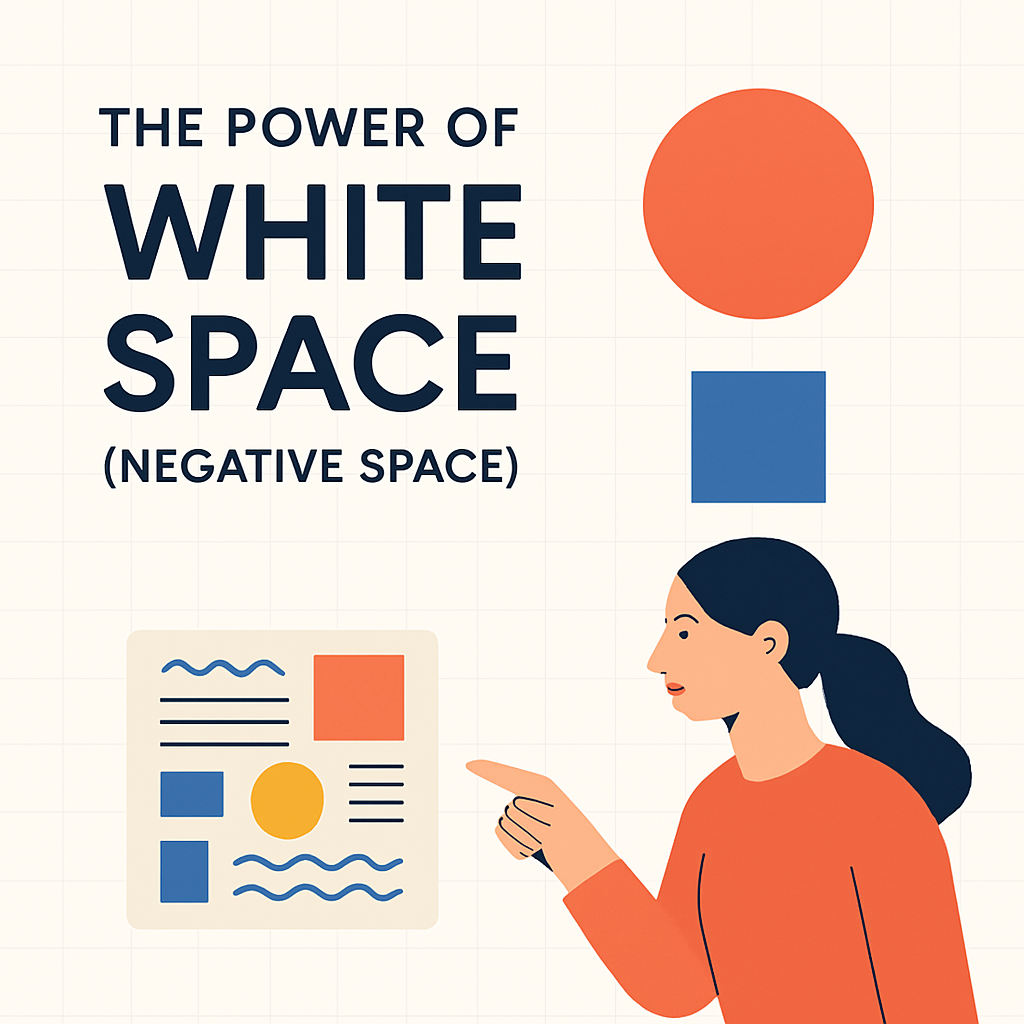
Welcome to Module 9, where we explore an often underestimated yet profoundly impactful element of design: white space, also known as negative space. White space refers to the empty areas in a design between and around elements such as text, images, and graphics. It's not necessarily "white"; it can be any color, texture, or even a background image, as long as it functions as a visual breathing room. This module will delve into the definition and critical importance of white space, distinguishing between micro and macro applications. We will examine how strategic use of white space can significantly improve readability, enhance focus, create balance and elegance, and ultimately elevate the overall user experience. Far from being merely "empty," white space is an active and essential component that shapes perception and clarifies communication.
Definition and Importance
White space, or negative space, is the unmarked portion of a page or layout. It encompasses the margins, gutters, space between columns, the spacing between lines of type, and the empty areas surrounding individual design elements. Its importance in design cannot be overstated. Effective use of white space is fundamental to creating layouts that are not only aesthetically pleasing but also highly functional. It acts as a separator and a connector, helping to define the relationships between different elements on the page. When used skillfully, white space reduces visual clutter, making content more digestible and less overwhelming for the viewer. It allows elements to breathe, giving them prominence and preventing them from competing for attention. A design crowded with too much information and too little white space can feel chaotic, stressful, and difficult to navigate, leading to a poor user experience and a failure to communicate the intended message effectively. Conversely, generous and thoughtful application of white space can convey sophistication, clarity, and confidence.
Micro and Macro White Space
White space can be categorized into two main types: micro white space and macro white space. Both play distinct yet complementary roles in design.
-
Micro White Space: This refers to the small spaces between finer elements within a design. Examples include the space between letters (kerning and tracking), the space between words, the space between lines of text (leading or line-height), the spacing within and around icons, and the padding within buttons or other UI elements. Careful attention to micro white space is crucial for readability and visual detail. For instance, appropriate line spacing makes paragraphs easier to read, while well-adjusted letter spacing enhances the legibility of typography. These seemingly small adjustments collectively contribute to a polished and professional feel.
-
Macro White Space: This refers to the larger empty spaces between major layout elements. Examples include the margins around a page, the space between columns of text or images, the space separating different sections of a webpage, or the large empty areas used to set off a particular focal point. Macro white space plays a significant role in guiding the user's eye, creating a sense of overall structure and balance, and establishing a visual hierarchy. It can be used to create emphasis, to separate distinct blocks of content, or to create a feeling of openness and calm. Strategic use of macro white space is often a hallmark of sophisticated and modern design.
Effective design requires a harmonious balance between micro and macro white space, ensuring both detailed legibility and overall compositional clarity.
Improving Readability and Focus
One of the most significant benefits of white space is its ability to improve readability and focus. When text is cramped, with insufficient space between lines or too close to other elements, it becomes difficult and tiring to read. Adequate micro white space, particularly leading (line-height), allows the eye to flow smoothly from one line to the next, reducing reader fatigue and improving comprehension. Similarly, macro white space around blocks of text helps to isolate them from other visual distractions, allowing the reader to concentrate on the content. By creating clear visual separation, white space helps users to quickly scan a page, identify important information, and focus on the task at hand. In user interface design, for example, ample white space around interactive elements like buttons and links makes them easier to identify and click, reducing errors and improving usability. It directs attention to key content and calls-to-action by removing surrounding clutter.
Creating Balance and Elegance
Beyond its functional benefits, white space is a powerful tool for creating visual balance and conveying a sense of elegance and sophistication. A design that effectively utilizes white space often feels more balanced, harmonious, and intentional. The empty areas are just as important as the filled areas in contributing to the overall composition. Macro white space can be used to create a sense of luxury, minimalism, or calm, depending on how it is applied. Think of high-end branding, art gallery layouts, or minimalist websites – they often employ generous white space to create a feeling of refinement and to give prominence to the content or products being showcased. White space allows design elements to stand out and be appreciated, much like a pause in music or a silence in a conversation can add emphasis and meaning. It is an active element that contributes to the overall aesthetic appeal and perceived quality of a design, transforming a potentially cluttered layout into one that is clear, composed, and visually engaging.