Module 11: Bauhaus Design Principles & Modern Application
Welcome to Module 11, where we explore the influential and revolutionary design movement known as Bauhaus. Originating in Germany in the early 20th century, Bauhaus (literally "building house") was more than just an art school; it was a philosophy that sought to unify art, craftsmanship, and technology. Its impact on modern architecture, art, and design, including graphic and web design, is undeniable and continues to resonate today. In this module, we will take a brief journey through the history and core philosophy of the Bauhaus movement, highlighting its famous maxim "Form Follows Function" and its goal of uniting art and craft. We will examine its key visual characteristics, such as the use of geometric shapes, clean lines, primary colors, and sans-serif typography. Furthermore, we will discuss Bauhaus grid systems and their enduring influence on contemporary design practices, particularly their relevance for creating structured, impactful, and functional social media graphics and web layouts. By understanding Bauhaus principles, you will gain insight into a foundational movement that shaped modern design thinking and discover how its tenets can still inspire innovative and effective visual communication.
Brief History and Philosophy of Bauhaus (Form Follows Function, Uniting Art & Craft)
The Staatliches Bauhaus was founded in 1919 in Weimar, Germany, by architect Walter Gropius. It operated in three cities—Weimar (1919-1925), Dessau (1925-1932), and Berlin (1932-1933)—before being closed due to pressure from the Nazi regime. Despite its relatively short lifespan, its influence was profound and far-reaching, largely due to the emigration of its key figures, who spread its teachings internationally, particularly to the United States.
The core philosophy of the Bauhaus was to bridge the gap between art and industry, and between the artist and the craftsman. Gropius envisioned a "new guild of craftsmen" that would erase the traditional distinctions between fine arts (like painting and sculpture) and applied arts (like furniture design, metalworking, and typography). The aim was to create functional, aesthetically pleasing objects and environments that could be mass-produced, making good design accessible to a wider public. A central tenet of Bauhaus philosophy is encapsulated in the phrase "Form Follows Function," popularized by architect Louis Sullivan and embraced by the Bauhaus. This principle asserts that the shape and appearance of an object or design should be primarily based upon its intended function or purpose. Aesthetics were not disregarded, but they were seen as arising from, and being integrated with, functional efficiency and suitability for the materials used.
Key Visual Characteristics: Geometric shapes, clean lines, primary colors, sans-serif typography
The Bauhaus aesthetic is characterized by several distinct visual elements that reflect its core philosophy of functionality, simplicity, and rationality:
- Geometric Shapes: Bauhaus design heavily emphasizes the use of fundamental geometric forms such as circles, squares, and triangles. These shapes were seen as pure, universal, and conducive to rational design and mass production.
- Clean Lines: Simplicity and clarity were paramount. Bauhaus designs typically feature clean, crisp lines and an absence of unnecessary ornamentation or decorative flourishes. The focus was on structural honesty and visual directness.
- Primary Colors (and Black & White): The Bauhaus color palette often revolved around the primary colors—red, yellow, and blue—along with black and white. These colors were considered fundamental and were used in a bold, often asymmetrical manner to create visual interest and define space without resorting to complex shading or traditional color harmonies.
- Sans-Serif Typography: In line with the pursuit of clarity and modernity, Bauhaus typographers championed the use of sans-serif typefaces. Fonts like Futura (designed by Paul Renner, though not directly at the Bauhaus, it shared its geometric ideals) and Herbert Bayer’s Universal typeface (which even eliminated uppercase letters for ultimate simplicity) became hallmarks of the movement. Sans-serifs were seen as more functional, legible, and representative of the machine age than the ornate serif or blackletter typefaces prevalent at the time.
These visual characteristics combined to create a style that was bold, minimalist, and highly influential, laying the groundwork for much of 20th and 21st-century graphic design.
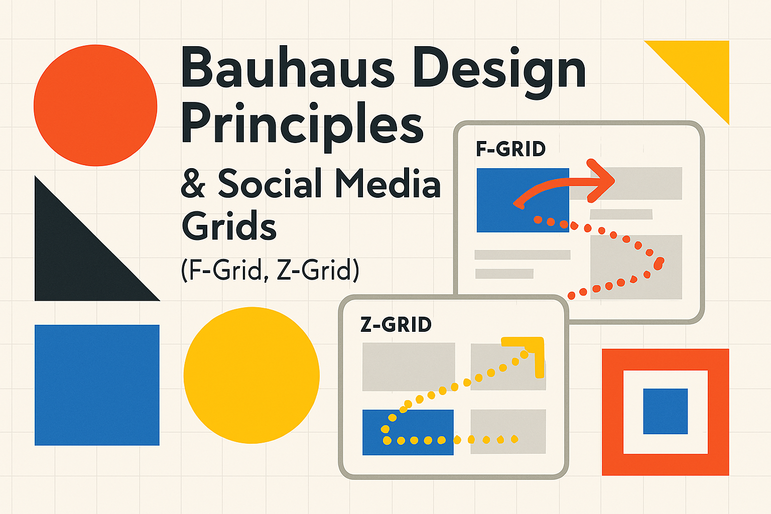
Bauhaus Grid Systems and their influence on modern graphic and web design
The Bauhaus placed a strong emphasis on order, rationality, and systematic approaches to design, which naturally led to the exploration and use of grid systems. While the highly structured grid systems often associated with Swiss Design (International Typographic Style) would be further developed later, the Bauhaus laid important groundwork. Bauhaus designers understood the power of the grid to bring harmony, consistency, and clarity to layouts, whether for posters, books, or architectural plans. The grid provided a framework for organizing diverse elements—text, images, and color—into a cohesive and unified whole. It facilitated asymmetrical balance, a common feature in Bauhaus compositions, allowing for dynamic yet ordered arrangements.
The influence of Bauhaus thinking on grid systems is evident in modern graphic design and particularly in web design. The principles of modularity, clear structure, and functional organization that were central to Bauhaus are fundamental to contemporary UI/UX design. Responsive web design, which relies on flexible grid layouts to adapt content to various screen sizes, can be seen as an evolution of these early modernist ideas about systematic design. The use of clear visual hierarchy, defined spacing, and logical grouping of elements in web interfaces all echo the Bauhaus pursuit of clarity and order through underlying structural systems.
Relevance for Social Media: Creating structured, impactful, and functional social media graphics
The principles of Bauhaus design remain highly relevant for creating effective social media graphics today. In a fast-scrolling, visually saturated environment, the clarity, impact, and functionality championed by Bauhaus can help content stand out and communicate effectively.
- Structure and Clarity: Using a simple grid (even an implied one) to structure social media posts can improve legibility and visual appeal. Aligning text and images, using clear geometric compositions, and maintaining consistent spacing can make posts easier to digest quickly.
- Impactful Visuals: The bold use of primary colors (or a limited, strong color palette), clean lines, and geometric shapes can create eye-catching graphics that grab attention in a crowded feed. Sans-serif typography ensures readability even at small sizes on mobile screens.
- Functionality: Remembering "Form Follows Function" is crucial. A social media graphic’s primary function is usually to convey a message, promote an action, or share information. The design should support this function. For example, if the goal is a click-through, the call-to-action should be clear and prominent, not obscured by excessive decoration. Bauhaus principles encourage a focus on the essential message, stripping away anything that doesn’t contribute to its effective delivery.
By applying Bauhaus-inspired approaches—focusing on simplicity, clear hierarchy, strong geometric forms, and functional typography—designers can create social media content that is not only aesthetically modern but also highly effective in communicating its intended message.