Module 8: Gestalt Principles – How the Brain Sees
Welcome to Module 8, where we delve into the fascinating world of Gestalt psychology and its profound impact on visual design. Gestalt (a German word meaning "unified whole" or "form") principles describe how humans naturally perceive visual elements and organize them into meaningful groups or patterns. Our brains are wired to simplify complex visual information, seeking to find order and structure even when presented with seemingly disparate elements. This module will explore the core Gestalt principles, including Proximity, Similarity, Closure, Continuity, Figure-Ground, and Common Fate. Understanding these principles is crucial for designers because they provide a scientific basis for creating compositions that are intuitive, coherent, and easily understood by viewers. By leveraging Gestalt theory, you can design visuals that resonate with the brain's innate tendencies, leading to more effective and engaging communication.
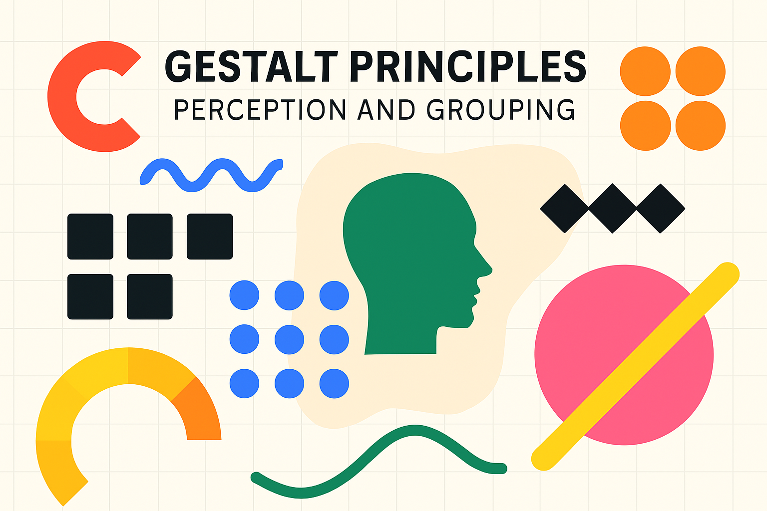
Principles: Proximity, Similarity, Closure, Continuity, Figure-Ground, Common Fate
The Gestalt psychologists identified several key principles that describe how we organize visual information:
-
Proximity: This principle states that objects or shapes that are close to one another appear to form groups. Even if the shapes, sizes, or colors are different, if they are placed near each other, we perceive them as being related or belonging together. Designers use proximity to group related information, such as placing a caption close to an image, or grouping related menu items together. This helps to create a clear structure and reduces visual clutter.
-
Similarity: We tend to group together elements that are similar in appearance. Similarity can be based on various attributes, such as color, shape, size, texture, or orientation. For example, a series of buttons that all share the same color and shape will be perceived as a related set of controls. Designers use similarity to create visual consistency, establish relationships between elements, and guide the user's attention to related items, even if they are spatially separated.
-
Closure: Our minds have a tendency to perceive incomplete shapes as complete. If enough of a shape is indicated, our brains will fill in the missing information to create a whole object. This is why we can recognize familiar shapes even if parts of them are obscured or missing. Designers can leverage closure to create interesting and engaging visuals, such as logos that use negative space or icons that are simplified yet recognizable. It allows for more minimalist designs that still convey clear meaning.
-
Continuity (or Good Continuation): This principle suggests that elements arranged on a line or curve are perceived to be more related than elements not on the line or curve. Our eyes tend to follow lines and curves, preferring to see continuous forms rather than abrupt changes. Designers use continuity to guide the viewer's eye through a composition, creating a sense of flow and direction. This is often seen in website navigation, where elements are aligned to create clear pathways, or in graphic design where lines or shapes lead the eye towards a focal point.
-
Figure-Ground: We instinctively perceive objects as either being in the foreground (figure) or the background (ground). The figure is the element that stands out and commands attention, while the ground is the surrounding area that appears to be further away. The relationship between figure and ground is crucial for creating clear and legible designs. Designers manipulate contrast, color, and other visual cues to define what is figure and what is ground, ensuring that important information is clearly distinguishable. Famous optical illusions, like Rubin's Vase, demonstrate the ambiguity that can arise when the figure-ground relationship is not clearly defined.
-
Common Fate: Elements that move in the same direction are perceived as being more related than elements that are stationary or move in different directions. This principle is particularly relevant in dynamic interfaces, animations, and video. For example, a dropdown menu where all items slide down together is perceived as a cohesive unit. In user interface design, elements that animate or transition together can reinforce their relationship and guide the user's understanding of how the interface functions.
How these principles help in creating unified and understandable designs
By understanding and applying these Gestalt principles, designers can create visual communications that are more intuitive, organized, and aesthetically pleasing. These principles are not just abstract theories; they are fundamental to how we make sense of the visual world. When a design aligns with these innate perceptual tendencies, it feels natural and easy to understand. Users can quickly grasp the structure of the information, identify relationships between elements, and focus on the intended message without conscious effort.
For instance, using proximity to group related form fields makes a form easier to fill out. Employing similarity in button styles across a website creates a consistent and predictable user experience. Leveraging closure can lead to clever and memorable logo designs. Applying continuity in a website layout can guide users smoothly from one section to another. Clearly defining figure-ground relationships ensures that text is legible and calls-to-action stand out. Using common fate in animations can make interface transitions feel more logical and less jarring.
Ultimately, Gestalt principles help designers to reduce cognitive load on the user. By organizing information in a way that the brain naturally prefers, we make it easier for users to process, understand, and remember the content. This leads to more effective communication, improved usability, and a more positive overall user experience. These principles are foundational tools for any designer seeking to create clear, coherent, and impactful visual work.