Module 7: Rule of Thirds – Visual Framing
Welcome to Module 7, where we explore a timeless compositional guideline beloved by photographers, filmmakers, and designers alike: the Rule of Thirds. This principle offers a simple yet remarkably effective way to create more balanced, dynamic, and visually engaging compositions. In this module, we will learn how to mentally divide a frame into nine equal parts and strategically place key subjects and elements along these lines or at their intersections. We will examine the application of the Rule of Thirds across various visual media, including photography, film, and user interface design, and discuss how it helps to create focal points and guide the viewer's eye. By mastering the Rule of Thirds, you will gain a valuable tool for enhancing the aesthetic appeal and communicative power of your visual creations.
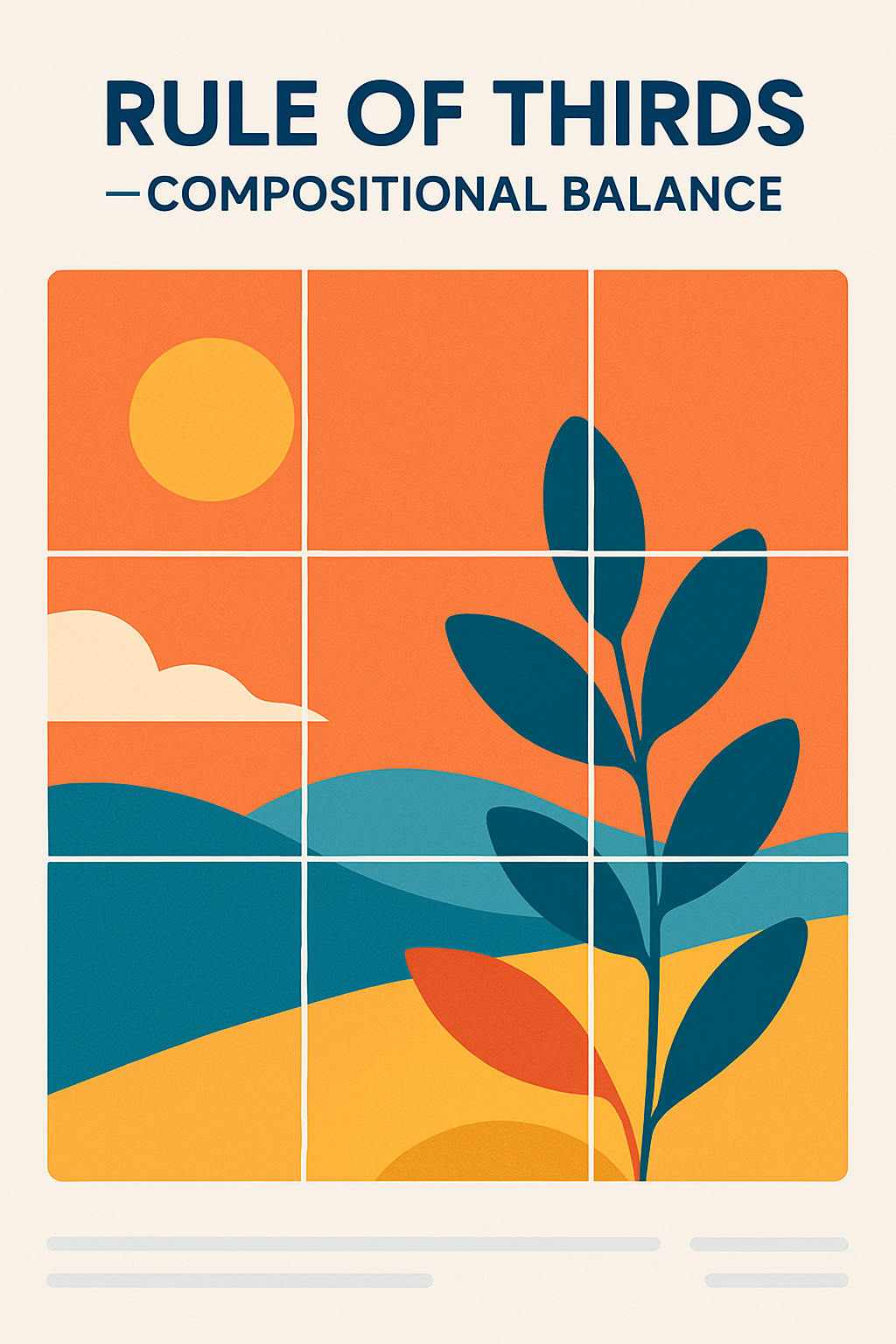
Divide Frame into 9 Equal Squares
The fundamental concept of the Rule of Thirds is straightforward. Imagine your design canvas, be it a photograph, a webpage layout, or a single graphic, divided into nine equal rectangular sections by two horizontal lines and two vertical lines, much like a tic-tac-toe grid. These lines are often referred to as "power lines," and their four intersections are known as "power points." The idea is not to perfectly center your subject, which can often lead to static and less interesting compositions, but rather to position important elements along these lines or at these intersections. This division creates a more dynamic and natural-feeling balance, encouraging the viewer's eye to move around the frame rather than being fixed on the center. Most digital cameras and design software offer an option to overlay a Rule of Thirds grid directly onto the viewfinder or canvas, making it easy to apply this principle during the creation process.
Place Subjects on Intersecting Lines or Points
Once you have visualized the Rule of Thirds grid, the next step is to strategically place your key subjects or focal points. Instead of placing your main subject directly in the center of the frame, try positioning it along one of the vertical or horizontal lines, or, for even greater emphasis, at one of the four intersection points. For example, in a landscape photograph, the horizon line might be placed along the top or bottom horizontal line rather than directly in the middle. This creates a more interesting division of space, allowing you to emphasize either the sky or the foreground. If you have a single dominant subject, such as a person in a portrait or a key button on a user interface, placing it at one of the power points can make it a strong focal point, drawing the viewer's attention effectively. When dealing with multiple elements, you can use the lines and intersections to create a balanced and harmonious arrangement, guiding the eye from one point of interest to another. The Rule of Thirds encourages a more thoughtful approach to composition, prompting designers to consider how elements relate to each other and to the overall frame.
Rule of Thirds in Photography, Film, and UI
The Rule of Thirds is a versatile principle with broad applications across different visual disciplines:
-
Photography: It is perhaps most famously used in photography. Photographers use it to compose shots of landscapes, portraits, and action scenes. Placing the horizon on a third line, positioning a subject off-center at an intersection, or aligning leading lines with the grid lines can dramatically improve the visual impact of an image.
-
Film and Cinematography: Filmmakers and cinematographers also rely heavily on the Rule of Thirds to frame shots. Characters are often positioned along the vertical lines, with their eyes aligning with a horizontal line, particularly an intersection point. This creates visually pleasing compositions that feel balanced and allow for negative space that can convey context or emotion. It also helps in creating a smooth visual flow when cutting between shots.
-
User Interface (UI) Design: While perhaps less explicitly discussed than in photography, the principles of the Rule of Thirds can be highly effective in UI design. It can guide the placement of key elements on a screen, such as logos, headlines, call-to-action buttons, and important images or graphics. For example, on a website homepage, the main headline or a hero image might be positioned to align with the power points to immediately draw the user's attention. In dashboards or complex interfaces, the grid can help to organize information into visually digestible sections, creating a sense of balance and order. Applying the Rule of Thirds can help make UIs feel more composed and less cluttered, guiding the user's eye to the most important interactive elements or information.
Understanding that the Rule of Thirds is a guideline, not an unbreakable law, is important. Sometimes, centering a subject can be a powerful choice for specific effects like symmetry or directness. However, mastering the Rule of Thirds provides a strong foundation for creating more dynamic and aesthetically pleasing compositions in a wide variety of visual contexts.