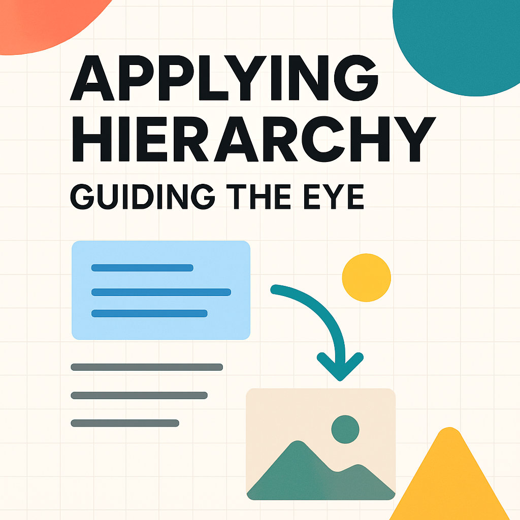
Module 3: Applying Hierarchy: Layout Patterns for Web & Social Media
Building upon our understanding of visual hierarchy from the previous module, we now delve into its practical application in the dynamic realms of web design and social media. This module specifically addresses how users visually scan and consume digital content, introducing key layout patterns such as the F-Pattern, Z-Pattern, and the Gutenberg Diagram. Understanding these patterns is crucial for designers aiming to create intuitive and effective online experiences. By strategically placing elements according to these natural scanning behaviors, we can significantly enhance user engagement, improve information absorption, and guide users towards desired actions. We will explore real-world examples from popular websites and social media platforms to illustrate these concepts and discuss how to leverage them to create compelling digital layouts.
Common Scanning Patterns: F-Pattern, Z-Pattern, Gutenberg Diagram
Eye-tracking studies have revealed that users don't read web pages or social media feeds word-for-word like they might read a book. Instead, they typically scan content in predictable patterns, looking for keywords, headings, and visual cues that signal relevance and interest. Several dominant scanning patterns have emerged from this research:
-
F-Pattern: This is one of the most common scanning patterns observed on text-heavy web pages, such as articles, blog posts, and search results. Users typically start by scanning horizontally across the top of the content area (forming the top bar of the "F"). Next, they move down the page a bit and scan horizontally again, usually for a shorter distance (forming the lower, shorter bar of the "F"). Finally, they scan the content's left side in a vertical movement. This pattern highlights the importance of placing key information and headlines at the top and left of the page, and using clear subheadings and bullet points to break up text and catch the eye during the vertical scan.
-
Z-Pattern: The Z-Pattern is more common on pages that are less text-heavy and have a more balanced distribution of visual elements and information, such as landing pages or advertisements. The viewer's eye typically sweeps horizontally across the top of the page from left to right (the top bar of the "Z"), then slants down and across to the bottom left (the diagonal of the "Z"), and finally scans horizontally across the bottom of the page from left to right again (the bottom bar of the "Z"). This pattern suggests placing important elements like logos and primary navigation along the top, key calls-to-action or focal points along the diagonal path, and supporting information or secondary calls-to-action along the bottom.
-
Gutenberg Diagram (or Gutenberg Rule): This pattern divides a layout into four quadrants: the primary optical area (top-left), the strong fallow area (top-right), the weak fallow area (bottom-left), and the terminal area (bottom-right). The Gutenberg Diagram suggests that the eye naturally sweeps from the primary optical area to the terminal area, with less attention paid to the fallow areas. This pattern is often applied to designs with evenly distributed, homogenous information. It implies that the most important information or starting point should be in the top-left, and the call-to-action or concluding information should be in the bottom-right. While less universally applicable than F or Z patterns in complex modern web design, it provides a useful foundational understanding of reading gravity.
Understanding these patterns helps designers anticipate how users will likely interact with their layouts, enabling them to place critical content and calls-to-action in areas of high visibility.
Guiding User Attention on Websites and Social Media Feeds
Applying these scanning patterns effectively means more than just knowing where the eye typically goes; it involves strategically designing the entire user experience. On websites, this means structuring homepages, product pages, and articles to align with these natural tendencies. For instance, a news website might use an F-Pattern for its article layouts, ensuring headlines and initial paragraphs capture attention quickly. An e-commerce site might use a Z-Pattern on a promotional landing page to guide users from a compelling headline to a product image and then to a "buy now" button.
In the context of social media, the feed itself often encourages a strong vertical scanning motion (part of the F-Pattern). Individual posts, however, must fight for attention within this rapid scroll. Therefore, understanding how to make a single social media graphic or video thumbnail quickly communicate its core message is vital. Using strong visual hierarchy within the post, placing key text or imagery where the eye is likely to land first (often the top and center of the post for initial fixation), and employing attention-grabbing visuals are all crucial. For platforms like Instagram, where the grid layout of a profile is also a design consideration, thinking about how individual posts contribute to a larger visual pattern becomes important, sometimes even forming larger Z or F patterns across multiple posts when viewed on a profile page.
Applying F-Grid and Z-Grid to Facebook Posts (1080x1080 Example)
When designing for specific social media platforms like Facebook, understanding common post dimensions and how scanning patterns apply within those constraints is key. For a typical square Facebook post (e.g., 1080x1080 pixels), you can strategically apply F-Grid or Z-Grid principles to maximize engagement:
F-Grid for Facebook (1080x1080):
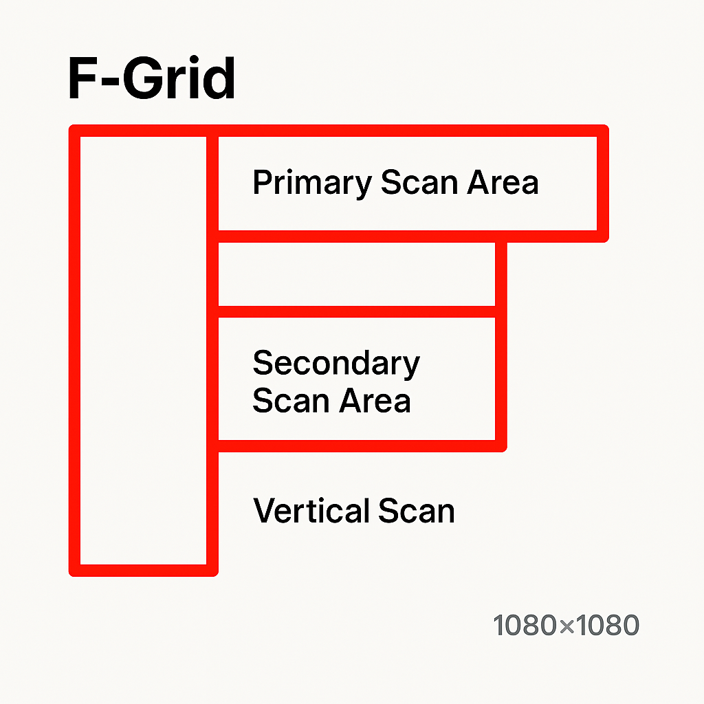
- Primary Scan Area (Top): Place your most compelling headline, brand logo, or key visual element here. This is the first horizontal scan users will make.
- Secondary Scan Area (Middle): Use this for supporting information, a brief description, or a secondary visual element. This scan is typically shorter.
- Vertical Scan (Left): Users will often scan down the left edge. Important text details, bullet points, or a call-to-action button can be effective here if the design allows for a strong left-aligned component.
Download F-Grid for Facebook (1080x1080 PNG)
Z-Grid for Facebook (1080x1080):
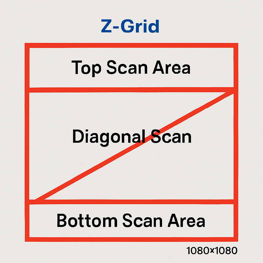
- Top Scan Area (Left to Right): Ideal for your brand logo/profile name on the left and a strong headline or primary visual element stretching across the top.
- Diagonal Scan (Top-Right to Bottom-Left or vice-versa): This is a powerful path for guiding the eye. Place key imagery, a compelling offer, or a focal point along this diagonal. The direction of the diagonal can be adapted based on your primary elements.
- Bottom Scan Area (Left to Right): A good spot for your call-to-action (e.g., "Learn More," "Shop Now"), website URL, or secondary information.
Download Z-Grid for Facebook (1080x1080 PNG)
By consciously using these grid overlays as guides, you can create Facebook posts that are more likely to capture attention and effectively communicate your message within the typical user scanning behaviors.
For detailed image ad size specifications for various social media platforms, please see our Social Media Ad Image Size Guide.
Examples of Effective Use in Popular Platforms
Many successful digital platforms intuitively incorporate these scanning patterns. Consider a typical Google search results page: the F-Pattern is clearly evident. Your eyes scan the top results horizontally, then perhaps a shorter scan of the next few, and then down the left side looking at titles. News websites like the BBC or New York Times often structure their articles with strong headlines and lead paragraphs at the top, followed by subheadings that break up the text, catering to the F-Pattern.
Facebook and Instagram feeds are primarily vertical, but individual ads or posts often use Z-Pattern principles within their rectangular space to guide the eye from a brand logo or user profile to an image and then to a call-to-action or caption. E-commerce sites like Amazon often use a combination: an F-pattern for browsing lists of products, but within a product page, a Z-pattern might guide you from the product title and images to the price and "add to cart" button.
By analyzing these popular platforms, we can see how these seemingly simple patterns are powerful tools for organizing information and creating user-friendly interfaces. The key is not to rigidly adhere to one pattern, but to understand the principles behind them and apply them flexibly to suit the specific content and goals of the design.