Module 2: Core Principles of Visual Hierarchy
Having established the importance of visual intelligence and design as communication in our first module, we now turn our attention to a critical concept that underpins effective visual communication: visual hierarchy. This module will explore how designers guide the viewer's eye and convey information in order of importance. We will dissect the key elements that contribute to a strong visual hierarchy, such as size, contrast, color, alignment, proximity, and repetition. Furthermore, we will examine how cultural reading patterns and natural eye movements influence how we perceive and process layouts. By understanding and mastering these core principles, you will be equipped to create designs that are not only aesthetically pleasing but also clear, intuitive, and highly effective in communicating their intended message.
Definition and Importance
Visual hierarchy refers to the arrangement and presentation of design elements in a way that implies importance. In simpler terms, it's about making the most important things stand out the most, and the least important things stand out the least. A well-executed visual hierarchy guides the viewer's eye through the content in a specific, intentional sequence, allowing them to quickly understand the structure of the information and identify key messages. Without a clear visual hierarchy, a design can appear chaotic, confusing, and overwhelming, forcing the user to expend unnecessary effort to decipher the information. This can lead to frustration, disengagement, and ultimately, the failure of the design to achieve its communicative purpose. In contrast, a strong visual hierarchy makes information accessible and digestible. It creates a sense of order and clarity, enhances readability, and improves the overall user experience. Whether designing a webpage, a poster, a mobile application, or even a simple document, establishing a clear visual hierarchy is paramount for effective communication and user engagement. It is the silent conductor that orchestrates the viewer's journey through your design.
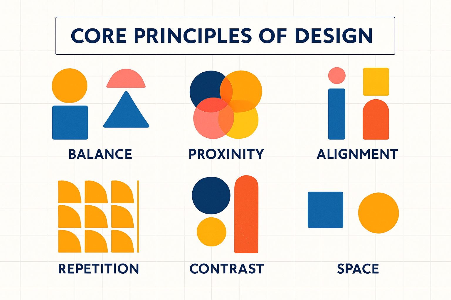
Key Elements: Size, Contrast, Color, Alignment, Proximity, Repetition
Several fundamental visual elements work in concert to establish a strong hierarchy. Understanding how to manipulate these elements is key to directing attention and conveying importance:
- Size: This is one of the most straightforward and effective ways to create emphasis. Larger elements naturally appear more important than smaller ones. Headlines are typically larger than subheadings, which are, in turn, larger than body text. This size differentiation immediately signals the relative importance of different pieces of information.
- Contrast: Contrast refers to the juxtaposition of visually dissimilar elements. This can be achieved through differences in color (e.g., a bright call-to-action button on a muted background), value (light vs. dark), texture, shape, or orientation. High contrast makes elements stand out, drawing the viewer's attention, while low contrast can make elements recede.
- Color: Color is a powerful tool for creating hierarchy and evoking emotion. Bright, bold, or warm colors tend to advance and attract attention, while cooler, more subdued colors tend to recede. Strategic use of color can highlight important elements, group related items, or create a specific mood. However, it's crucial to use color thoughtfully and consider accessibility, ensuring sufficient contrast for all users.
- Alignment: Alignment creates a sense of order and connection between elements. When elements are aligned along a common edge or center, they appear related and visually organized. Consistent alignment contributes to a clean, professional look and makes it easier for the eye to scan and process information. Misalignment, on the other hand, can create visual clutter and disrupt the flow.
- Proximity: The principle of proximity states that elements placed close together are perceived as being more related than elements spaced further apart. Grouping related items (e.g., an image and its caption, or a heading and its corresponding paragraph) helps to create logical connections and makes the information easier to understand. White space (which we'll cover in a later module) plays a crucial role in defining proximity and separating distinct groups of information.
- Repetition: Repeating visual elements such as colors, shapes, typefaces, or spatial relationships throughout a design creates consistency and reinforces a sense of unity. Repetition can also contribute to hierarchy by establishing patterns. For instance, consistently using a specific color and font style for all primary headings helps users quickly identify them across different sections of a website or document.
By skillfully combining these elements, designers can create a clear and effective visual hierarchy that guides users effortlessly through the content.
Order of Importance (Top to Bottom, Left to Right)
In many Western cultures, reading patterns typically follow a top-to-bottom, left-to-right direction. This ingrained habit significantly influences how users scan and perceive visual layouts. Designers often leverage these conventions by placing the most important information, such as logos and primary navigation, at the top of a page, and key headlines or starting points of content towards the top-left. This doesn't mean all content must rigidly adhere to this flow, but understanding these dominant scanning patterns is crucial for placing critical elements where they are most likely to be seen first. We will explore specific scanning patterns like the F-pattern and Z-pattern in the next module, which further elaborate on how users typically consume digital content. Recognizing these natural tendencies allows designers to strategically position elements to maximize visibility and impact, ensuring that the visual hierarchy aligns with common user behaviors.