Module 5: Hick’s Law – Cognitive Load and Choice
In our journey through design principles, we now arrive at Hick's Law, a crucial concept that directly addresses the relationship between the number of choices presented to a user and the time it takes for them to make a decision. This psychological principle has profound implications for interface design, particularly in an age where users are often bombarded with information and options. This module will explore the fundamentals of Hick's Law, discussing how an overabundance of choices can lead to decision paralysis and increased cognitive load. We will examine practical strategies for simplifying interfaces, such as progressive disclosure and minimalist design approaches, and look at real-world examples in forms, menus, and filtering systems. By understanding Hick's Law, you will learn how to design more efficient, user-friendly experiences that reduce frustration and help users achieve their goals more quickly.
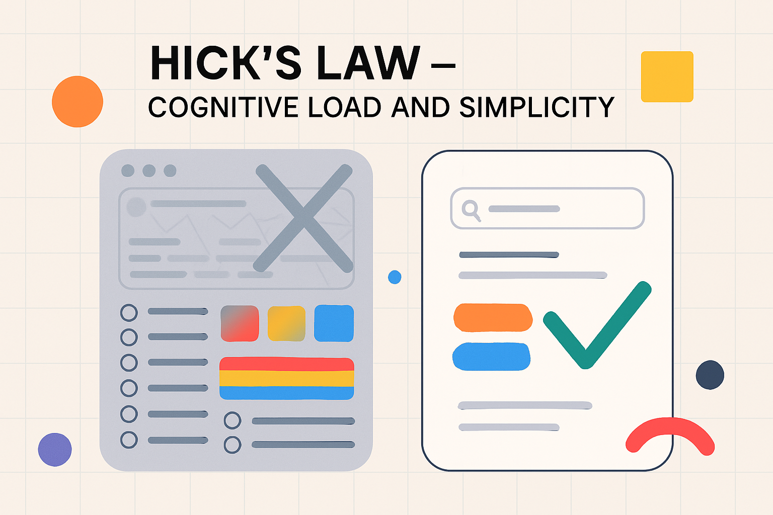
Hick’s Law: More Choices = Slower Decisions
Hick's Law, also known as the Hick-Hyman Law, mathematically describes the time it takes for a person to make a decision as a result of the possible choices he or she has. In essence, it states that the more choices available to a person, the longer they will take to reach a decision. The relationship is logarithmic, meaning that while the decision time increases with each additional option, the rate of increase slows down as the number of options gets very large. However, the core takeaway for designers is straightforward: an excess of choices can overwhelm users, leading to slower decision-making, increased error rates, and often, a feeling of frustration or confusion. This is because each additional choice requires mental processing – evaluation, comparison, and selection. When the number of choices becomes too large, this mental effort, known as cognitive load, can become excessive, hindering the user's ability to make a timely and satisfactory decision. This phenomenon is sometimes referred to as "decision paralysis" or the "paradox of choice," where too many options can lead to inaction or dissatisfaction with the choice ultimately made.
Simplicity in Interface Design (Menus, Forms)
One of the most direct applications of Hick's Law is in the pursuit of simplicity in interface design. Designers should strive to minimize the number of choices presented to users at any given point, especially for critical tasks or frequently used functions. This is particularly relevant in the design of navigation menus, forms, and selection controls.
For navigation menus, instead of presenting a flat list of dozens of options, consider grouping related items into categories, using hierarchical menus (like dropdowns or mega menus) thoughtfully, or providing clear pathways to more specific options. The goal is to guide the user progressively rather than confronting them with all possibilities at once.
In form design, Hick's Law suggests keeping forms as concise as possible. Only ask for essential information. Break down long forms into multiple, manageable steps or sections. Use clear labels and provide sensible defaults where possible. For input fields that require users to choose from a list (e.g., dropdowns, radio buttons), limit the number of options if feasible, or provide search/filter functionality if the list is inherently long. The aim is to make the process of completing a form feel effortless and quick, reducing the cognitive burden on the user.
Progressive Disclosure
Progressive disclosure is a powerful interaction design technique that directly addresses Hick's Law by managing information complexity. It involves initially showing users only the essential options and then revealing more advanced or less frequently used options if and when the user requests them or as they progress through a task. This approach keeps interfaces clean and uncluttered for novice or typical users, while still providing access to full functionality for expert users or those with specific needs. Examples of progressive disclosure include "Advanced Settings" links that expand to show more options, "Read More" buttons that reveal additional content, or multi-step wizards that guide users through complex processes one step at a time. By deferring non-critical choices, progressive disclosure reduces the initial cognitive load, making interfaces feel simpler and easier to learn, and allowing users to focus on the task at hand without being overwhelmed by too many choices simultaneously.
Real-world Examples: Forms, Menus, Filters
Hick's Law is evident in many well-designed digital products. Consider the main navigation menu of a complex e-commerce website. Instead of listing every single product category on the main bar, they often use broad categories that expand into more specific sub-categories upon hover or click. This tiered approach helps users narrow down their choices progressively.
Online forms, such as those for creating an account or checking out, often benefit from Hick's Law. A well-designed checkout process might be broken into clear steps: shipping information, billing information, payment, and review. Each step focuses on a limited set of inputs, making the overall process feel less daunting.
Filtering systems on e-commerce sites or content platforms are another excellent example. When searching for a product, users might be presented with numerous filter options (e.g., brand, price, size, color, rating). A good design will present these filters in an organized manner, perhaps with the most commonly used filters displayed prominently and less common ones accessible via an "Advanced Filters" option. This allows users to quickly apply the filters most relevant to them without having to sift through an exhaustive list of all possible criteria at once. These examples demonstrate how thoughtful application of Hick's Law can lead to more intuitive and efficient user experiences by simplifying choices and reducing cognitive load.